.png)
Rejuvenation
Optimizing User Experience solutions by designing landing pages, homepages and product pages
Tools
Figma
Jira, Airtable
AEM
Adobe Premiere Pro
Curalate
Team
1 Senior UX Designer
2 Junior Designers
1 Copywriter
2 Site Managers
3 Developers
My Roles
Senior Designer
UX Manager
Art Director
UX Researcher
UX Writer
Timeline
Feb 2023 – Present
Opportunity
Rejuvenation is the fastest growing brand in the Williams Sonoma family of companies. The brand has grown over 20% year over year for the past 5 years. Rapid growth requires lean teams and agile solutions.
Solution
Operate at peak efficiency utilizing design systems, art direction and best practices. Lead a team of designers, collaborating with marketing and merchandising leaders to bring campaigns and initiatives to life.
Noteworthy Projects
Product Information Pages
UX Research + Redesign to drive conversion for configured products
Landing Pages
Product launches and lookbooks meant to inspire and inform
Project Guides
Educational resources to improve customer confidence
Homepages
Campaigns at the highest level, establishing art direction for all channels
1. Product Information Pages
The ultimate point-of-sale, the Product Information Page, or PIP, is arguably the most critical position in the customer funnel. As a little sister brand to Williams Sonoma and Pottery Barn, Rejuvenation rides on the coat tails of their technical developments, picking up feature improvements and performance learnings nearly every week. For this reason, PIPs became a bit of a Frankenstein of design enigmas over time.
For this project, I oversaw a Junior UX Designer who led the prototyping and QA, and we collaborated closely with executive leadership, developers, site management and merchandisers on the collective goal to improve the experience and increase conversion.
Step 1: Define Goals and Objectives
Step 2: Analyze Hierarchy and Style Guides (or lack thereof?)
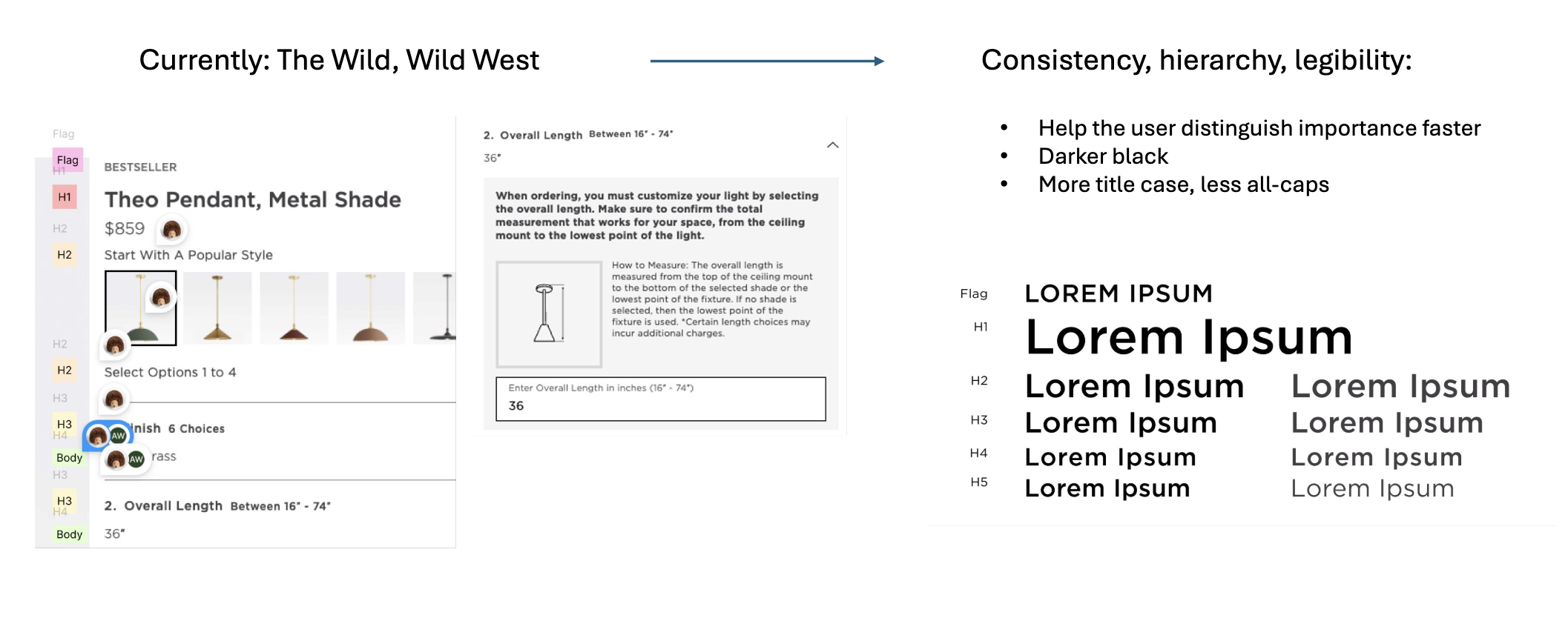
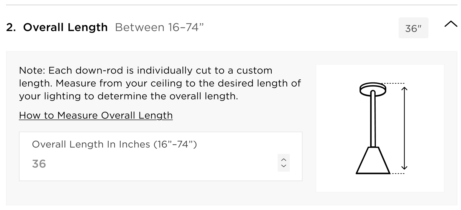
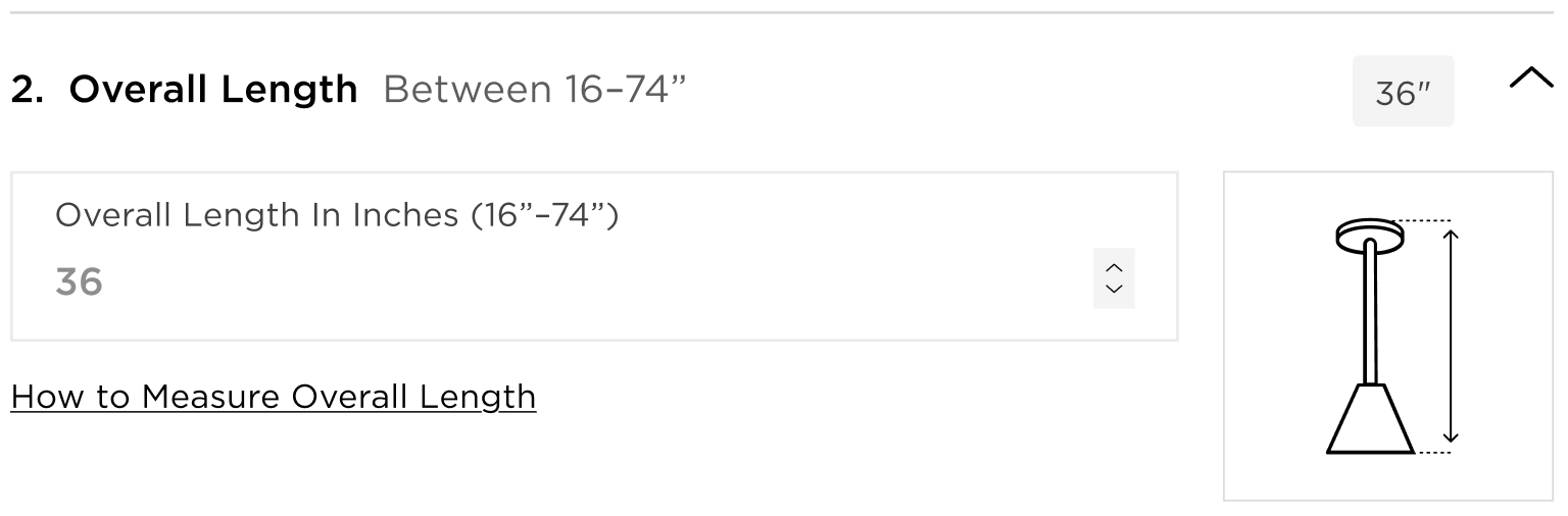
Next, we systematically evaluated the existing design, functionality, and user experience of our configured lighting PIPs. Configured lighting is the bread and butter of Rejuvenation's business, and also the most complicated offering. These products are highly customizable, which leads to some complex design problems and plenty of opportunity to improve. Some of the most visually impactful improvements from this project came from simply establishing clearer text styles.
Step 3: Ideate and Iterate
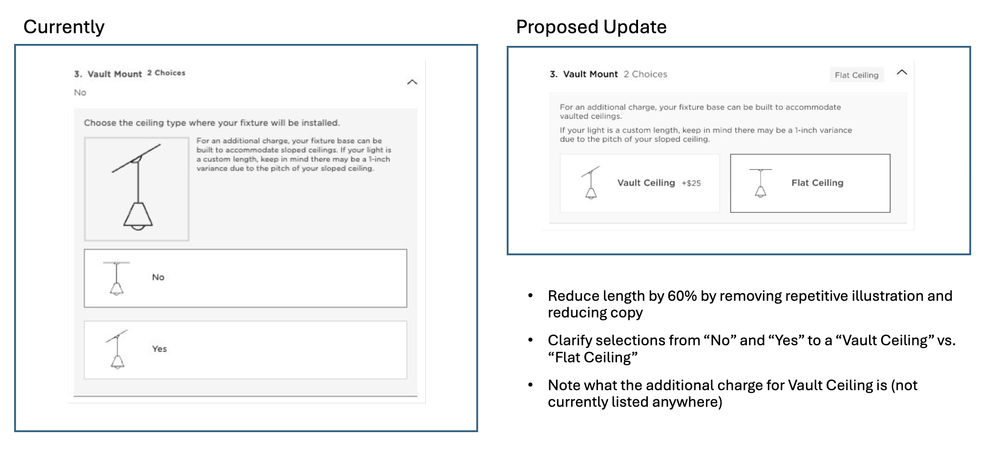
Much like a closet clean out, we next needed to tackle every drawer, line by line, revisiting educational copy, illustrations, and CTAs. We were asked by leadership to specifically improve length, so brevity was a primary priority for each component. This was a project of hundreds of small, impactful design choices that were meant to blend in seamlessly, rather than reinventing the wheel. Below is just one of these seemingly infinite proposals:
Step 4: Prototype and Present
I oversaw a junior designer who took the lead on prototyping, while I owned visual design direction and overall experience.
It was crucial for the prototype to be as realistic as possible, so that we could present and workshop refined design solutions. Working closely with leadership and cross-functional partners including the brand president, merchandisers, site management and front-end developers, we were able to explore a wide range of opportunities and possibilities, ultimately landing on a collective solution.

Step 5: Usability Testing
Before implementing the redesign, it was crucial to verify the newest concepts with usability testing.
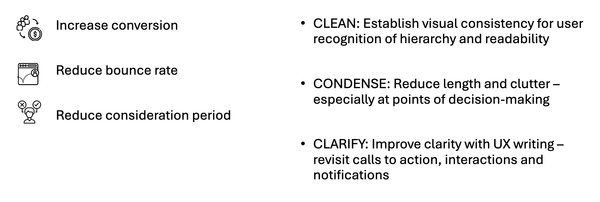
7 participants completed usability tests. Our primary focus was to gather information about whether users prefer more or less educational content in order to drive confident conversion.
Version testing:
Educational Copy: 4 users received educational copy in the configuration trays. 3 users received minimal educational copy in the configuration trays. Tooltips provided additional information on-click in both versions.
Desktop/Mobile: 3 users completed tests for mobile devices, and 4 users completed tests for desktop devices.
Educational Copy:
Minimal Copy:
Results: All tests were completed successfully, and expressed confidence in their shopping experience. 2 of the 3 users who received minimal educational copy engaged with the Tooltip feature to seek more information. There was conflicting feedback from 2 users who received educational copy – one user said it was too much text, and one user expressed appreciation for the information.
Learning: Educational content is crucial for confident conversion, and users are able to find it by using a Tooltip. Our recommendation: Utilize Tooltip functionality to surface educational content in the Buy Box configuration trays. Watch for increased returns due to overall length or ceiling mount.
2. Landing Pages
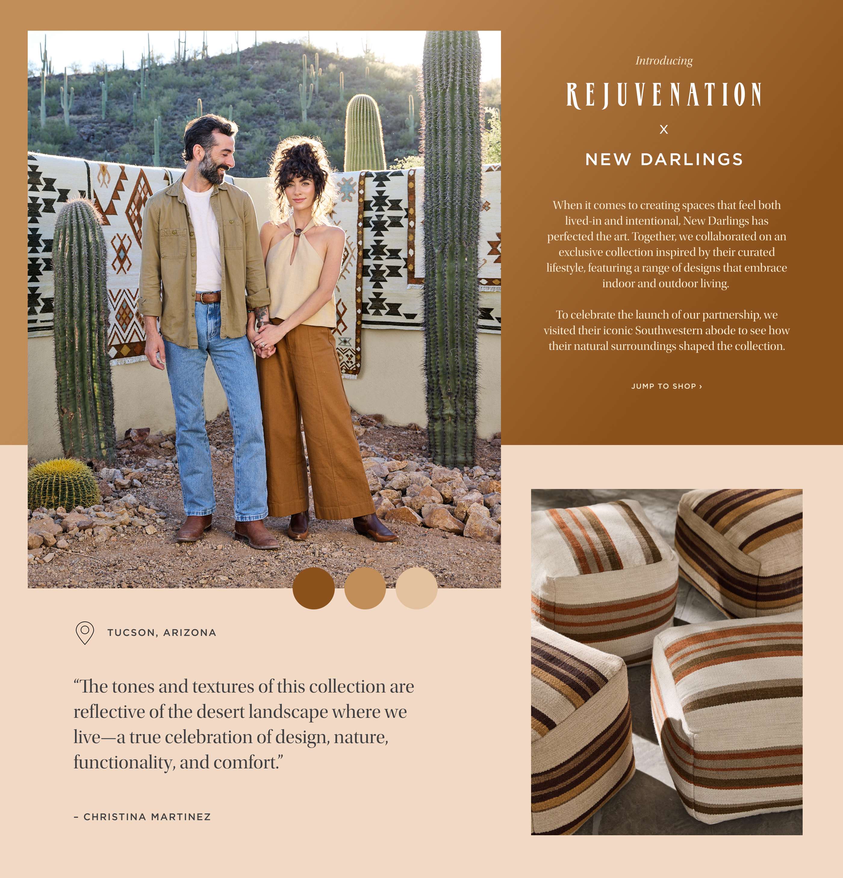
Rejuvenation x New Darlings
To celebrate the launch of a Rejuvenation product collaboration with influencer duo New Darlings, I was tasked with creating a digital experience that captured the aesthetic of the collection. It was imperative to integrate our partners' look and feel with Rejuvenation brand standards.
My work stood on the shoulders of giants – the product design and photography teams led the way with a warm color palette to draw from, dramatic natural elements, and a gorgeous sense of texture.
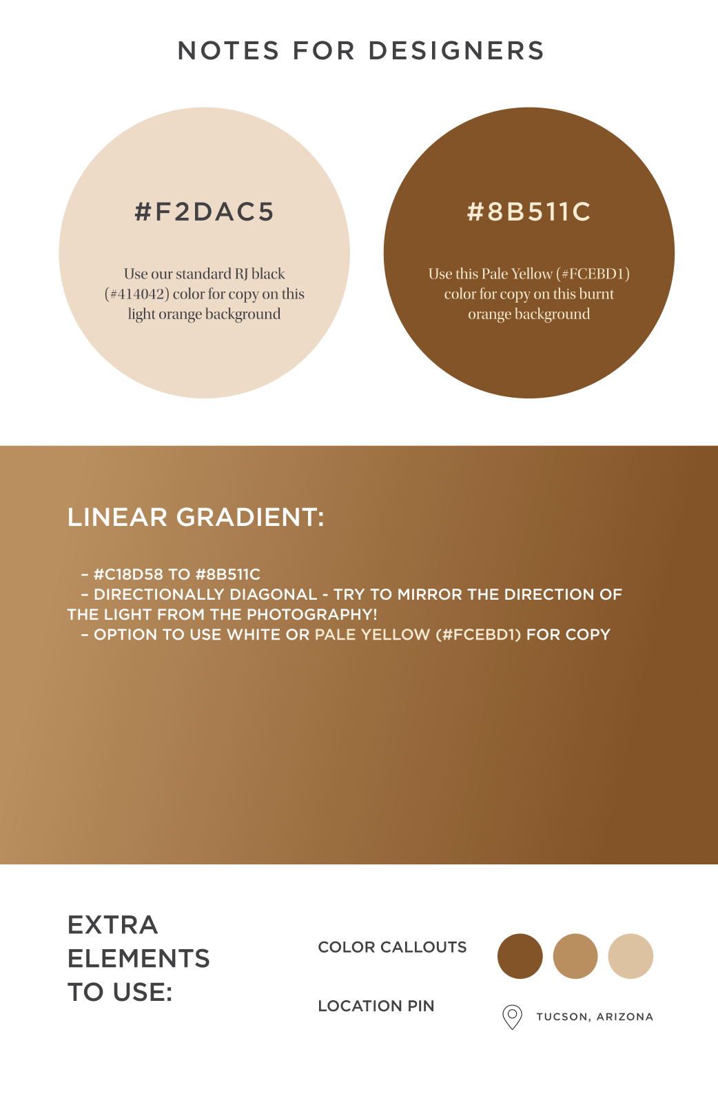
Creative direction embraced the design of the products, creating clear visual ties between the natural landscape in the photography, product details, and digital design elements. I was particularly pleased with the subtle touch of a gradient to mimic the warm sun flares that showed up in much of the photography.
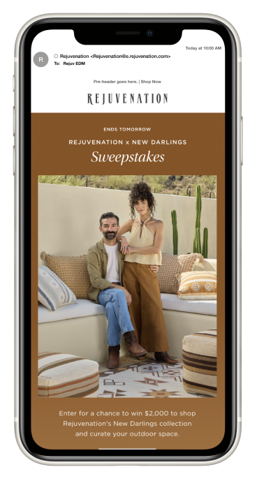
The building blocks of this landing page design trickled down through the rest of our creative marketing channels, showing up in social media, email and our retail stores.
In order to maintain consistency across channels, I passed creative direction along to my colleagues. It was a joy to see this work come to life through different experiences.
3. Project Guides
Driving conversion through educational resources
Drove over $5 million of conversion participation with comprehensive guides that support customers with renovations and home projects. Collaborated with merchandisers, copywriters and marketers to develop content that inspires and informs customers to complete confident purchases.
4. Homepages
Each month, I lead the end-to-end design of Rejuvenation.com’s homepage, translating high-level marketing strategies into compelling digital experiences. I present this work regularly to executive leadership—including the brand president and VP—for iterative feedback and approval, ensuring alignment across business priorities. The homepage sets the creative tone for all marketing channels, informing visuals and messaging across paid and organic social, digital advertising, email, and in-store promotions. Balancing brand storytelling with performance goals, I craft designs that drive engagement, support merchandising strategies, and reflect seasonal campaigns with precision and impact.
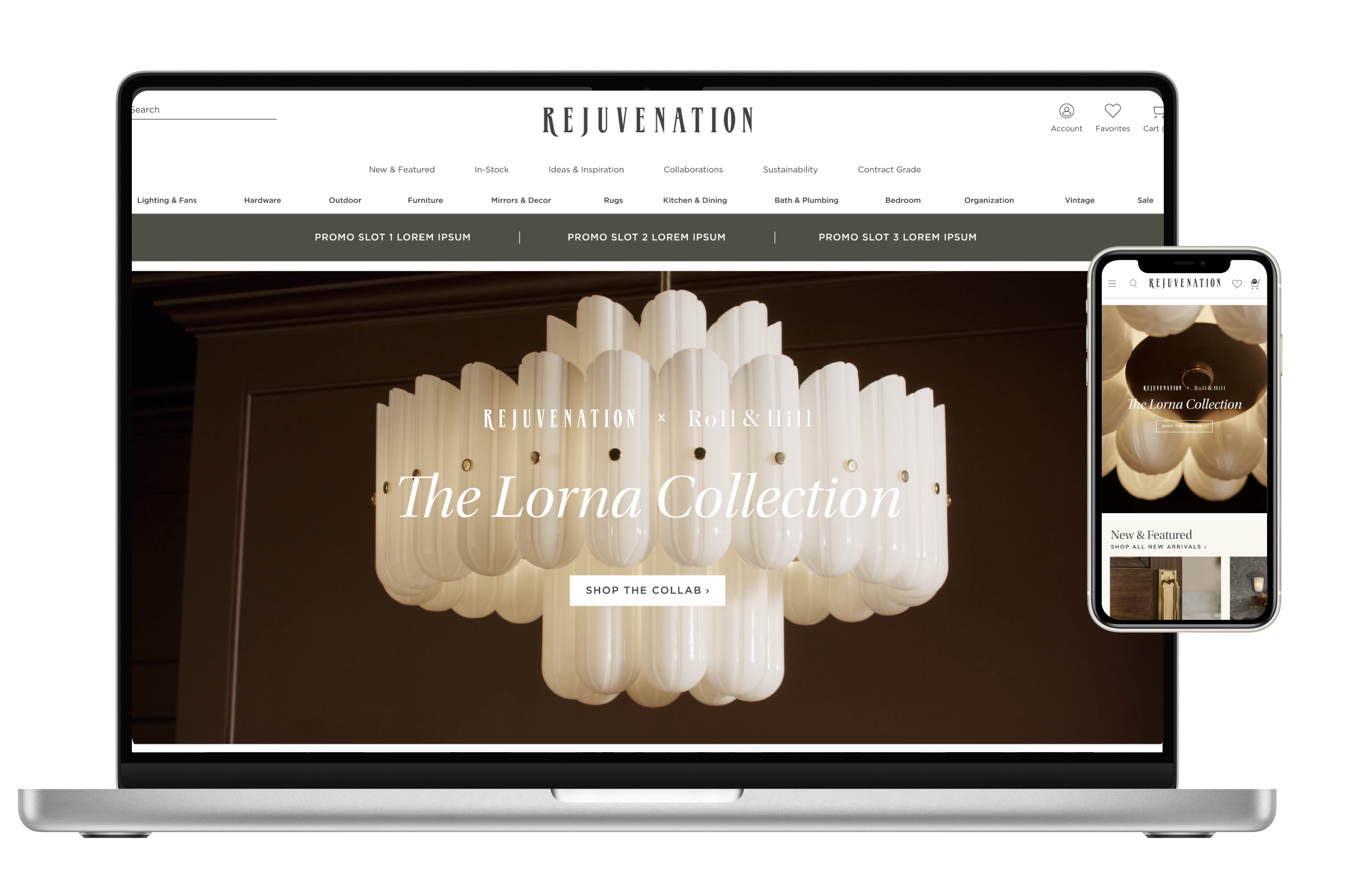
Current Homepage at Rejuvenation.com